Client
Edit Disruptive Education
Role
UX Design + UI Design
Tools
Milanote + Numbers + Xtensio + Balsamiq + Sketch
Team
Rui Parada [UX] + Jorge Maia [UX]
Edit Disruptive Education
Role
UX Design + UI Design
Tools
Milanote + Numbers + Xtensio + Balsamiq + Sketch
Team
Rui Parada [UX] + Jorge Maia [UX]
Background
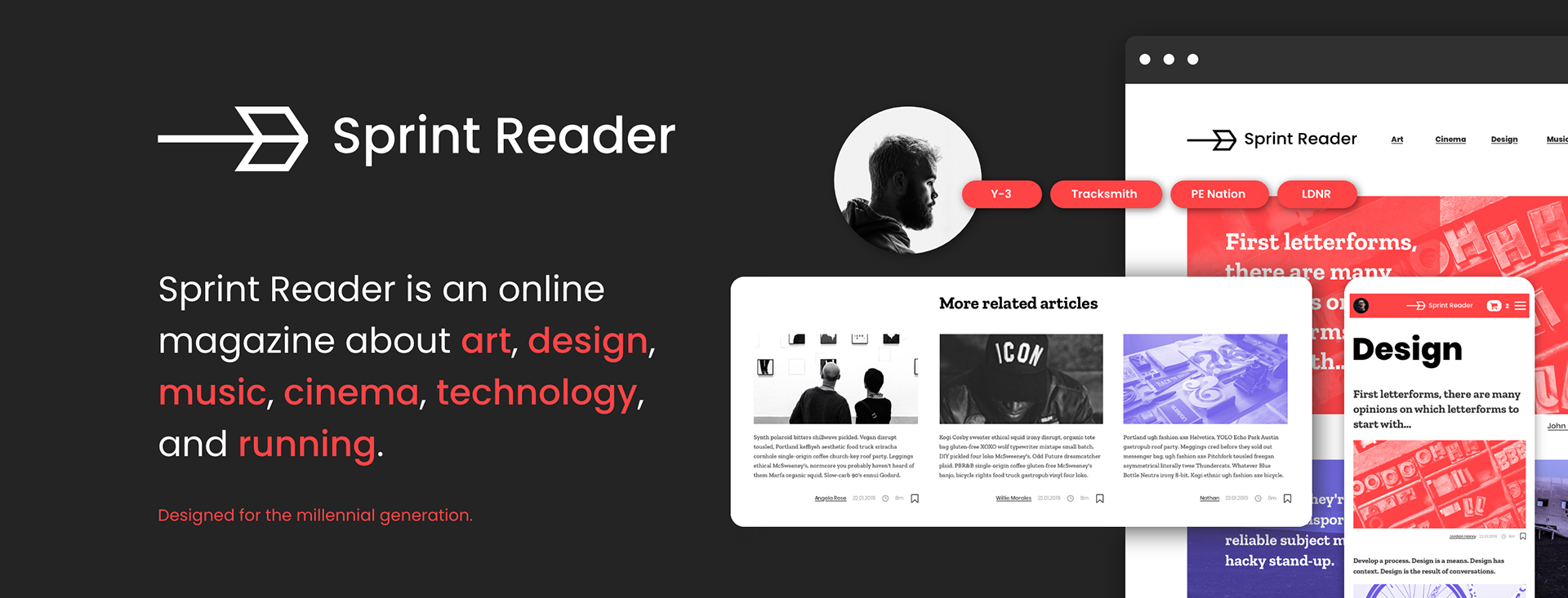
Sprint Reader is an online magazine focusing on art, design, music, cinema, technology, and, more recently ... running.
It was designed for the millennial generation, living a fast passed life, on a ‘permanent sprint’.
Sprint Reader publishes an average of 6 daily articles and has already a list of 114 articles.
It was designed for the millennial generation, living a fast passed life, on a ‘permanent sprint’.
Sprint Reader publishes an average of 6 daily articles and has already a list of 114 articles.
Challenge
Sprint Reader needed a new website that reflected the brand culture in the best way possible.
Sprint Reader is strongly committed to immediacy and easy access to the content it publishes.
The brand concept revolves around two axes: on the one hand, the brand promotes information as a source of wisdom, on the other hand, it also aims to promote a dynamic and healthy lifestyle. The recent inclusion of sports articles is precisely in this direction.
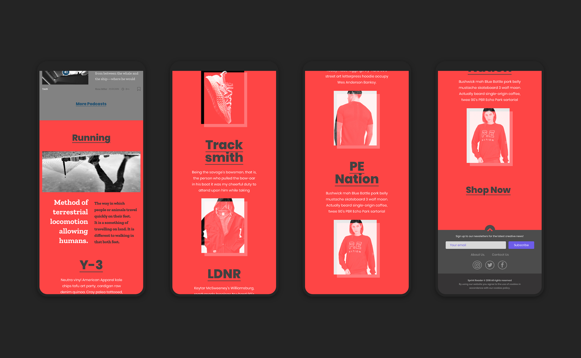
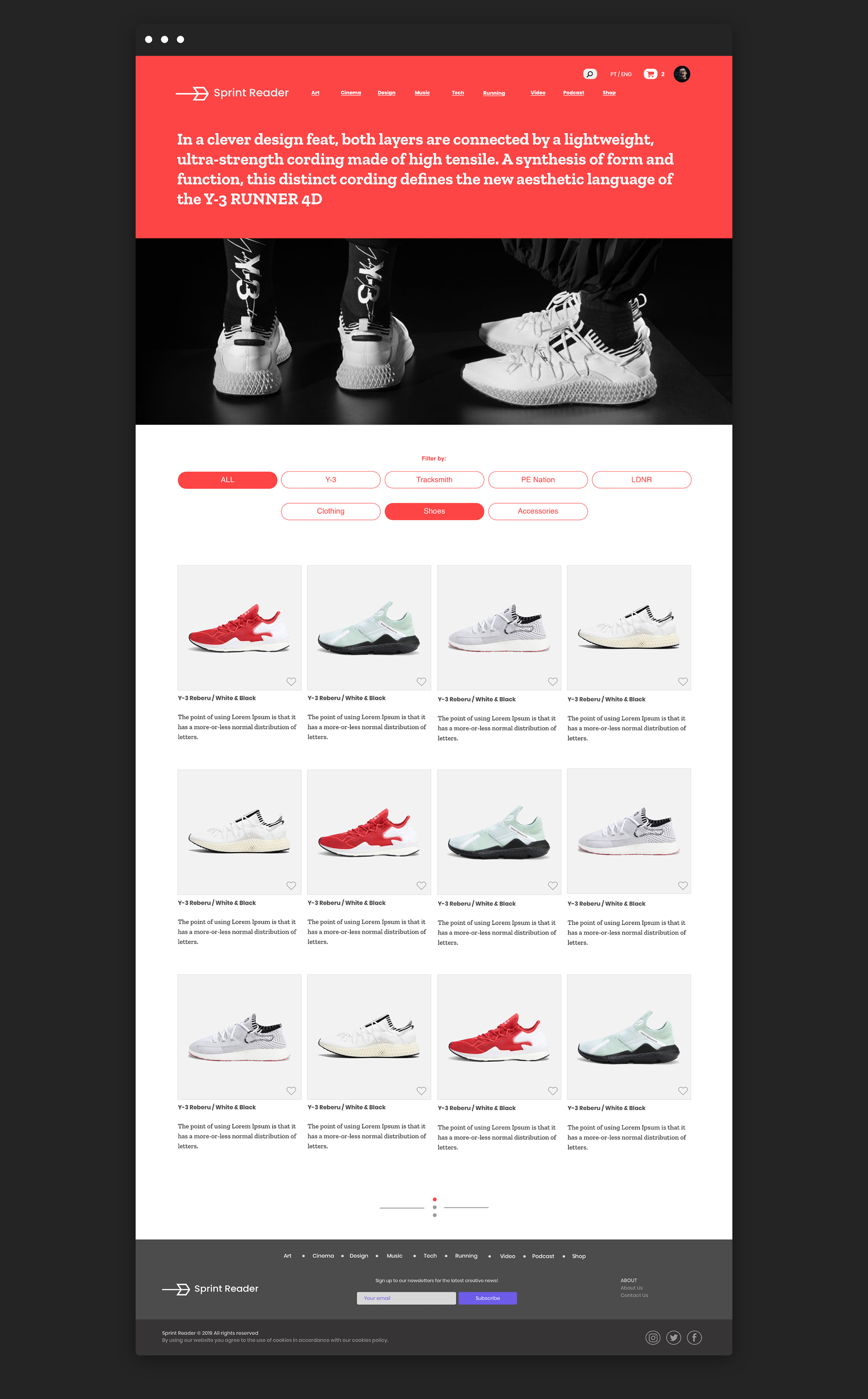
Along with this addition to the editorial line, Sprint Reader will start selling Activewear and Running articles on its website.
Sprint Reader is strongly committed to immediacy and easy access to the content it publishes.
The brand concept revolves around two axes: on the one hand, the brand promotes information as a source of wisdom, on the other hand, it also aims to promote a dynamic and healthy lifestyle. The recent inclusion of sports articles is precisely in this direction.
Along with this addition to the editorial line, Sprint Reader will start selling Activewear and Running articles on its website.
Competitive Analysis
Based on a comparative analysis with direct competitors, we defined a list of valuable insights:
• Dos and Dont's
• Pros and Cons
• Best Practices
• Content Styles
• Pros and Cons
• Best Practices
• Content Styles
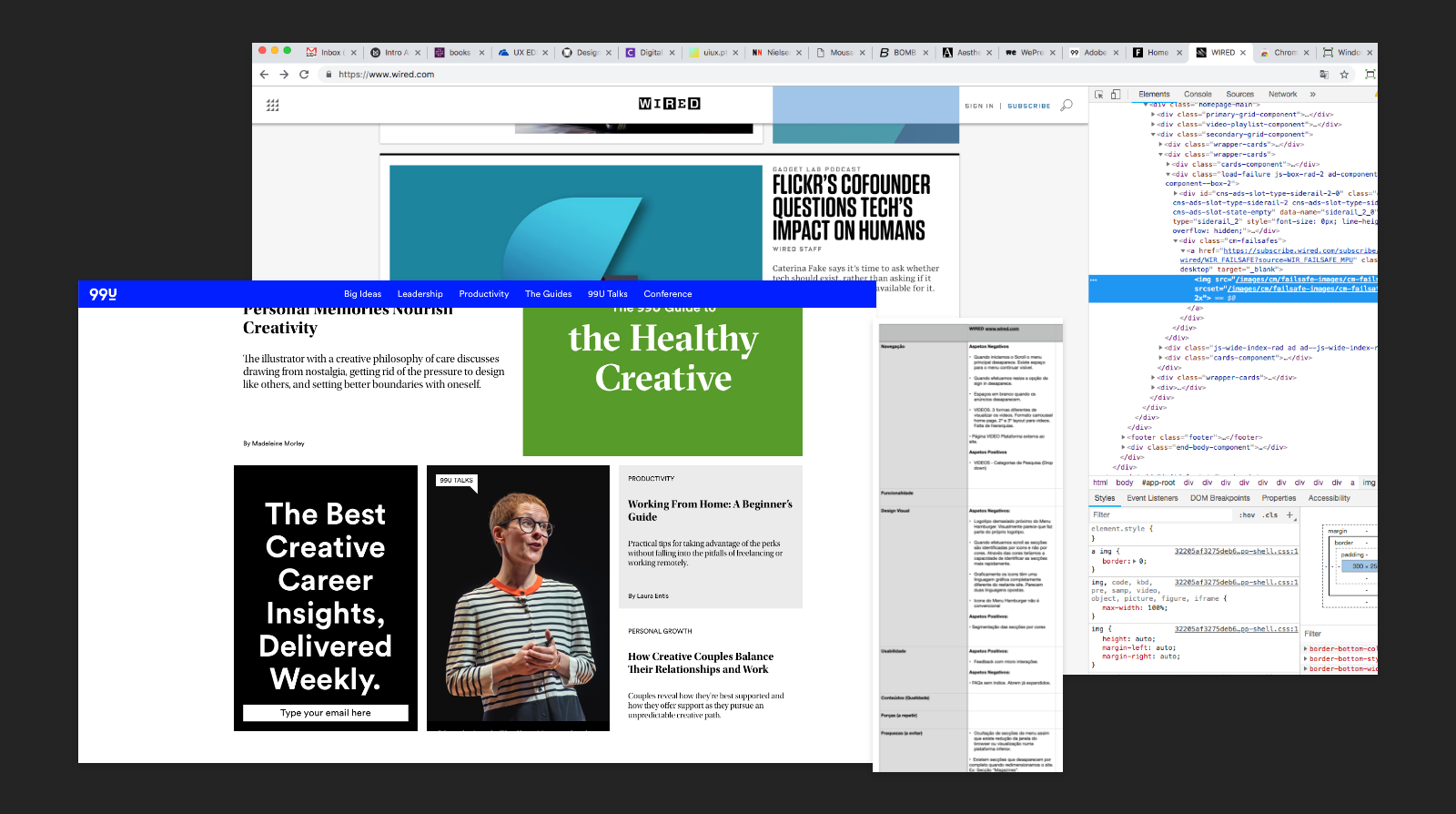
Qualitative Research
For qualitative analysis, we interviewed 7 users, aged 28 to 40.
Some of the questions asked:
• What kind of articles are you looking for on the web?
• What websites or digital applications do you use to access these articles?
• Do you access these articles more on your phone or on your desktop?
• Do you prefer faster or slower reading articles?
• Do you ever listen to podcasts? If your answer was ‘yes’, how often do you do it?
• What do you do to save an article to read or watch later?
• Do you listen to music or podcasts while you run?
• Do you buy sports products in online stores?
• Do you prefer to buy using the desktop or mobile version?
• What was your best experience with an online purchase?
After analyzing all the data we obtained quite interesting results. It helped us understand which platforms users navigate, their preferences, favorite features, shopping habits, and weaknesses presented.
One of the most important pieces of information was how we became aware that few users like to listen to podcasts while running, something that we initially thought would be one of their main options.
One of the most important pieces of information was how we became aware that few users like to listen to podcasts while running, something that we initially thought would be one of their main options.
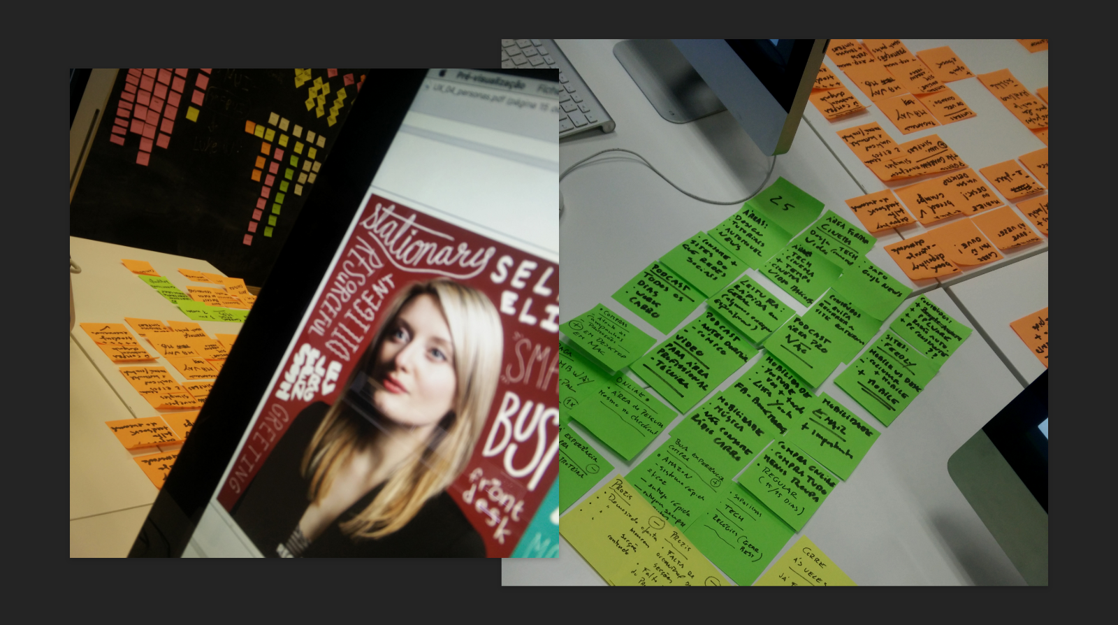
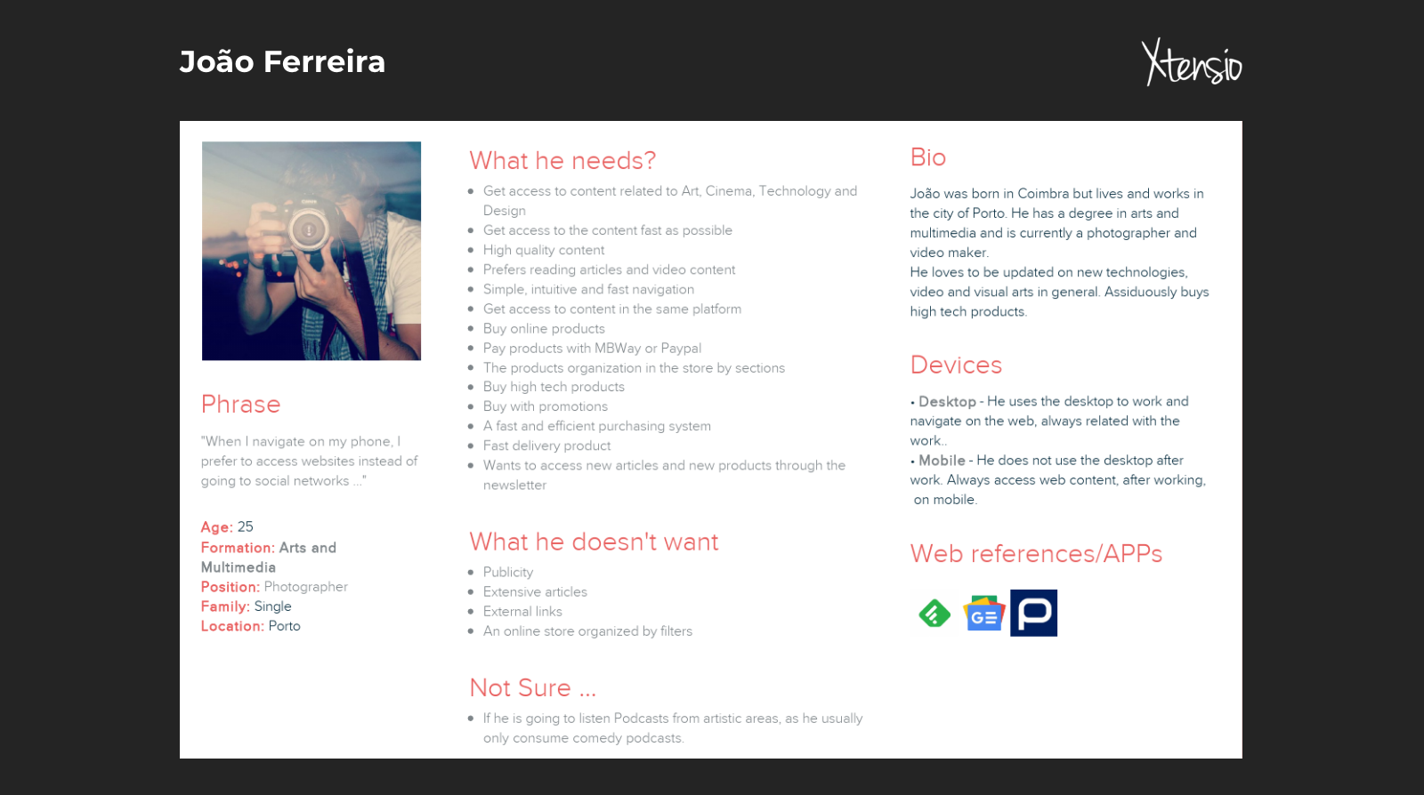
Personas
The one-on-one interviews helped us create the persona for possible target customers.
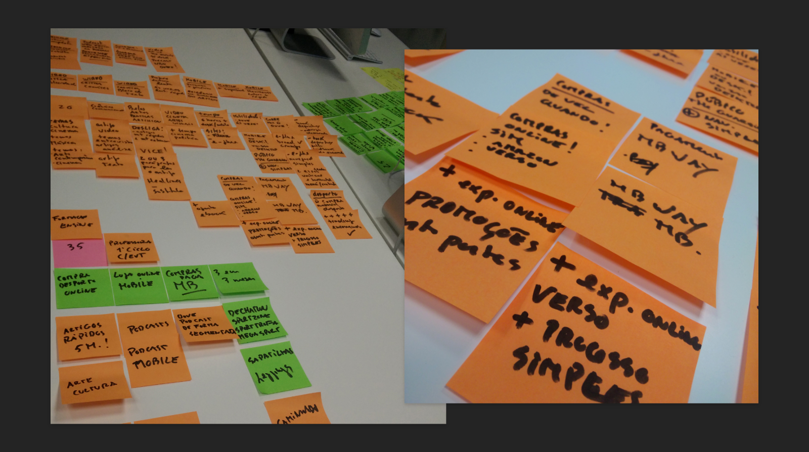
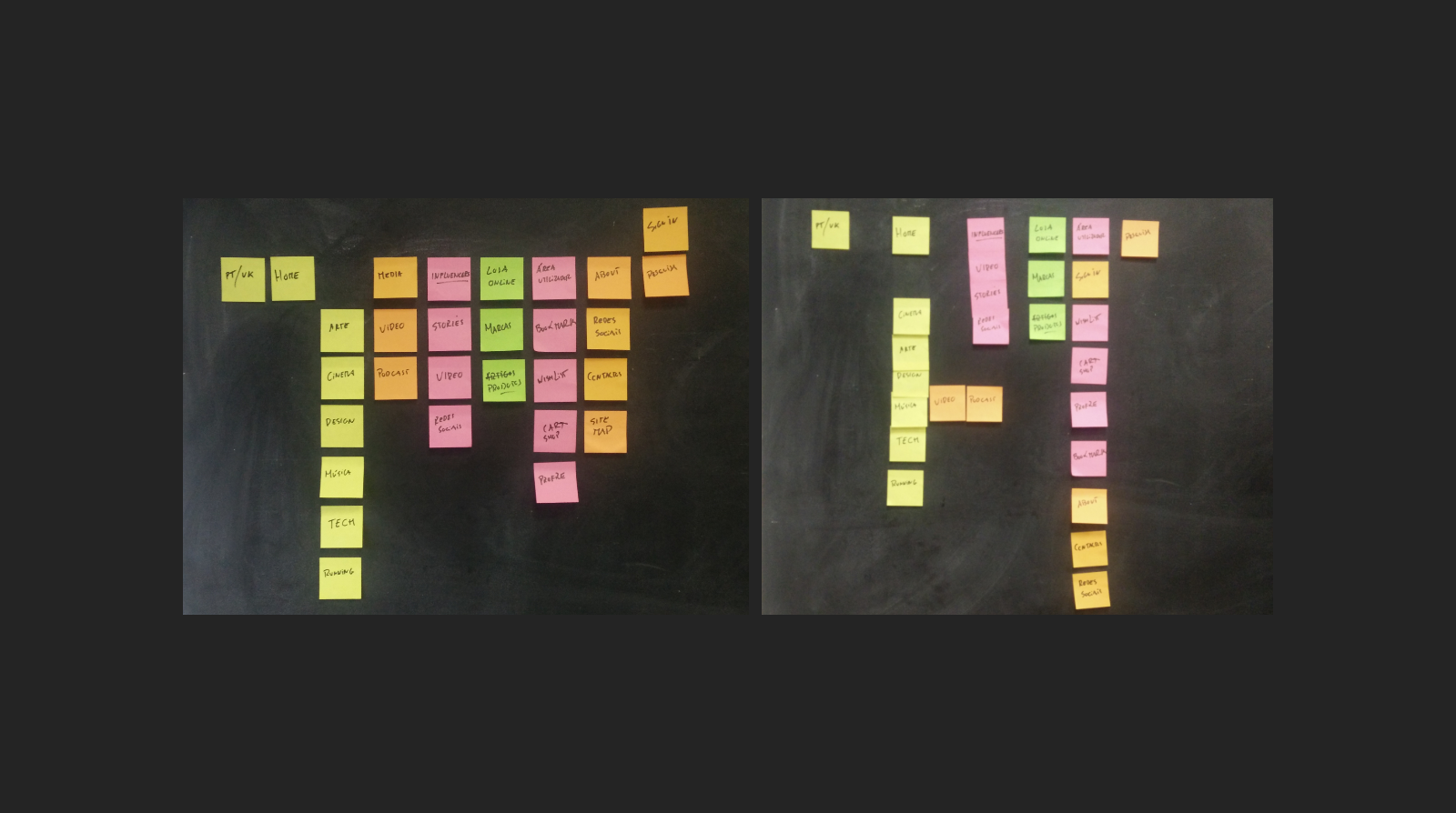
Architecture Information
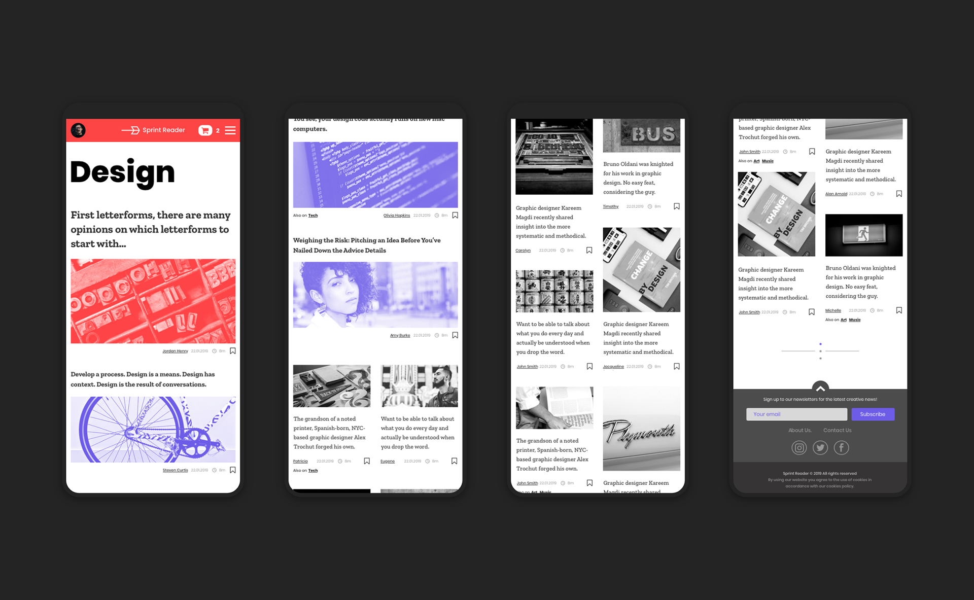
After the user requirement, we used the card sorting process to get an idea of the features and the product user flow. This process helped us define the desktop and mobile versions.
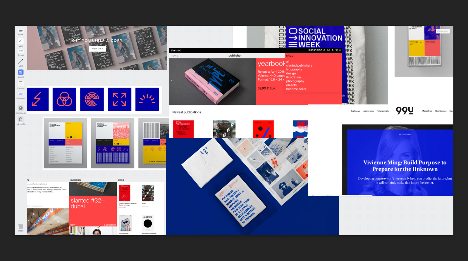
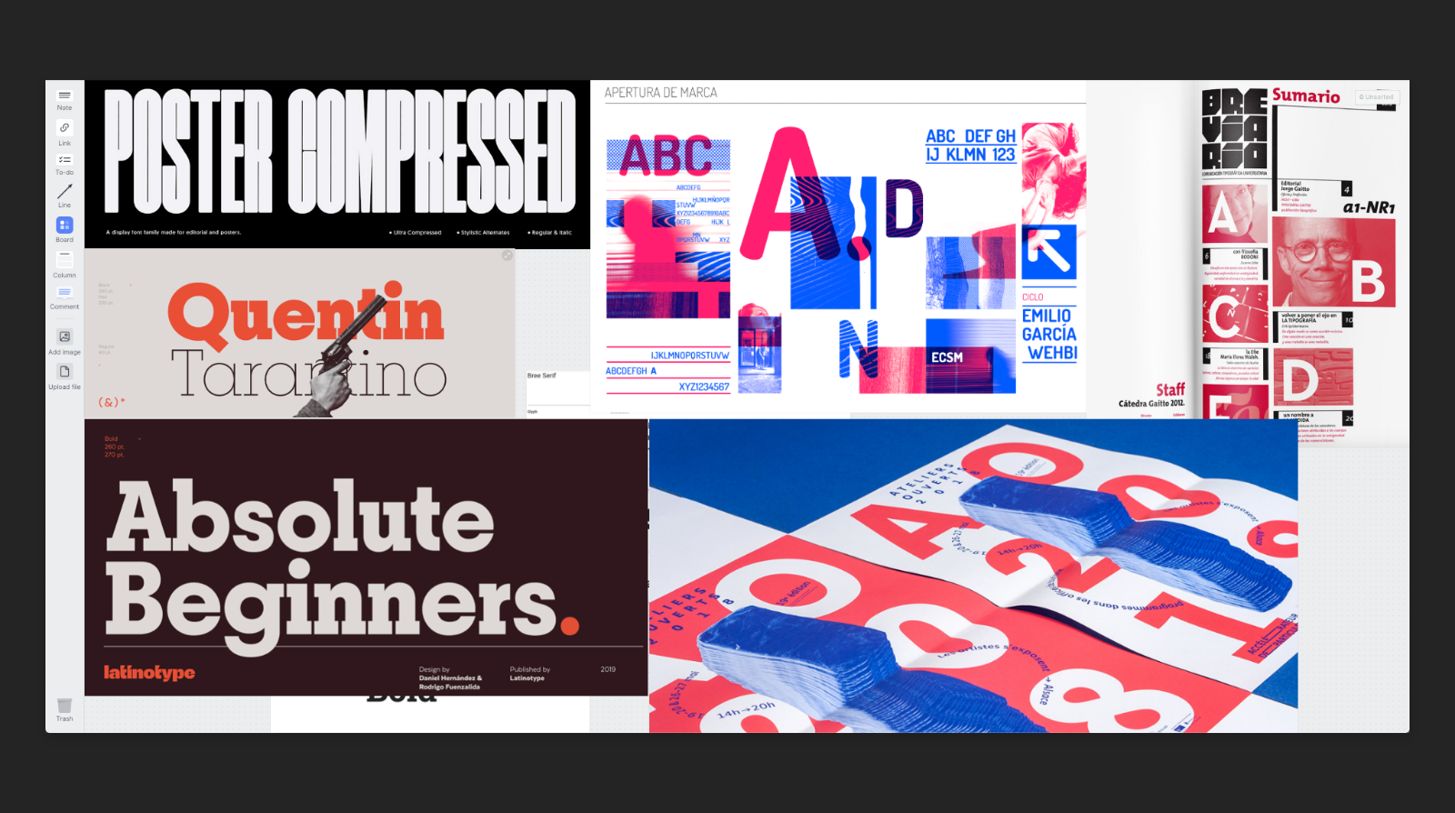
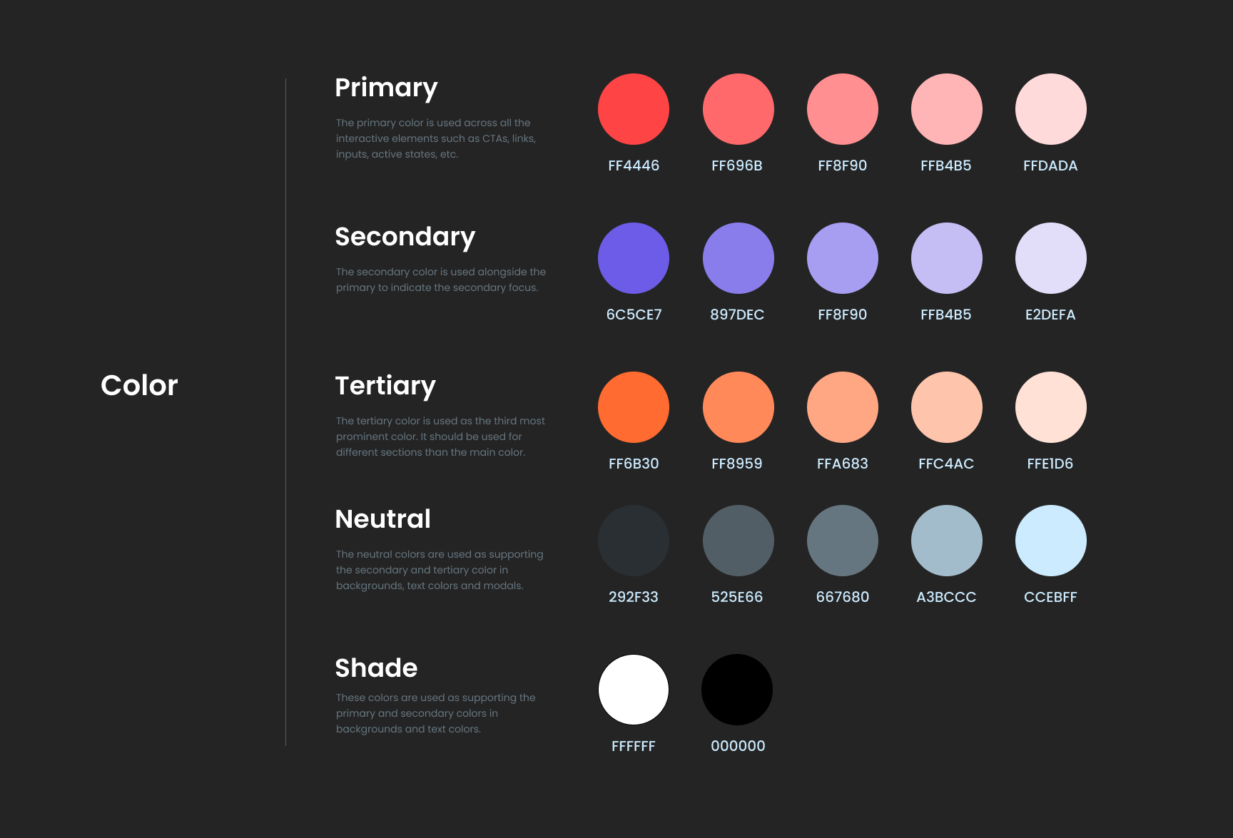
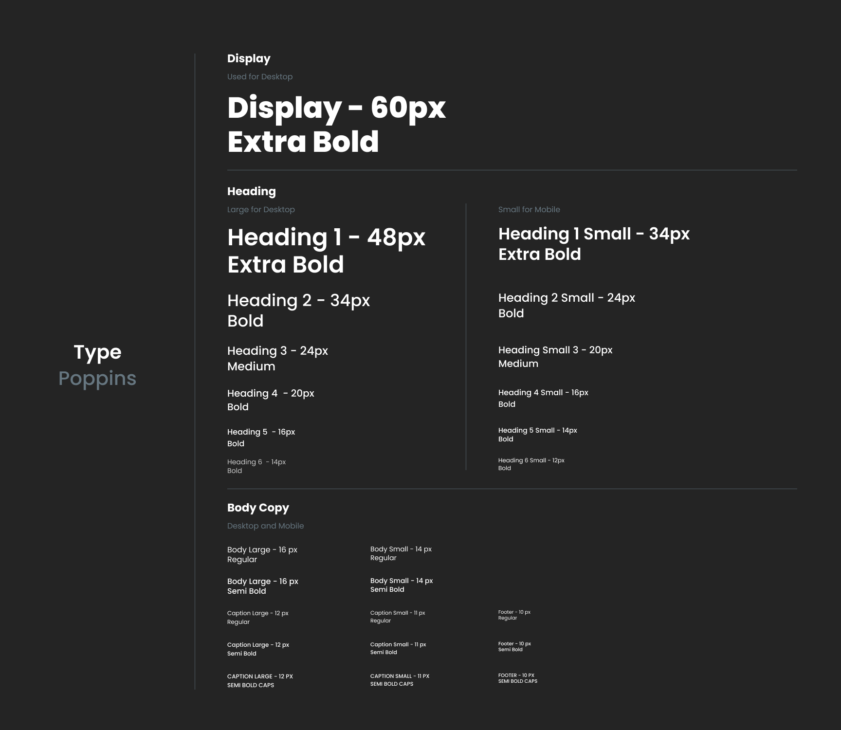
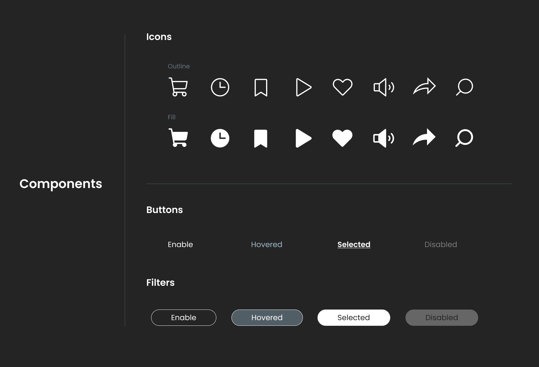
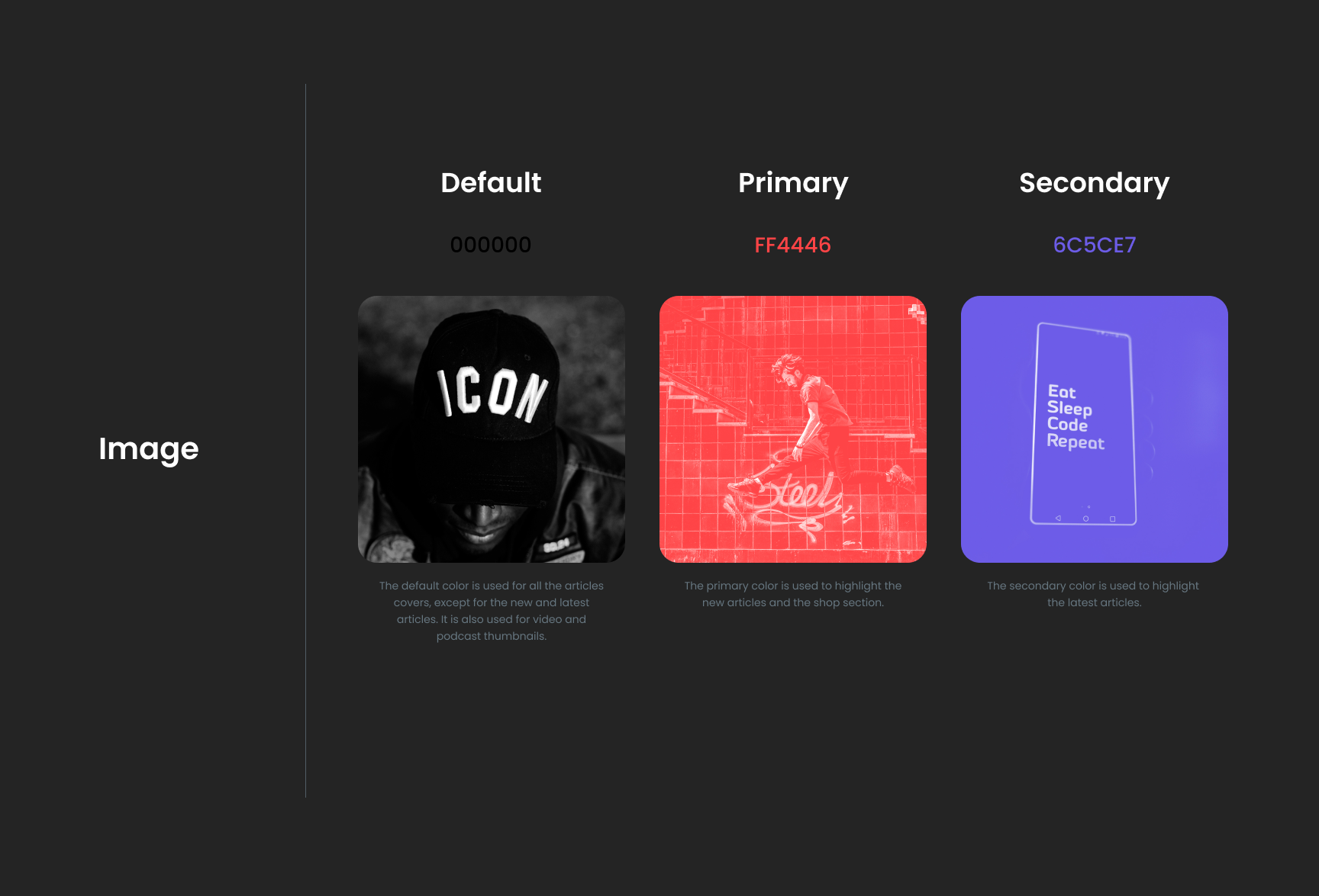
Mood Board and Style Guide
We had in mind a specific concept before we defined our mood board: a fresh, modern, and impactful language designed to match our target audience, the Millenials. Black and white images were used as neutral colors, and we defined a fresh color palette to contrast and highlight the most important content.
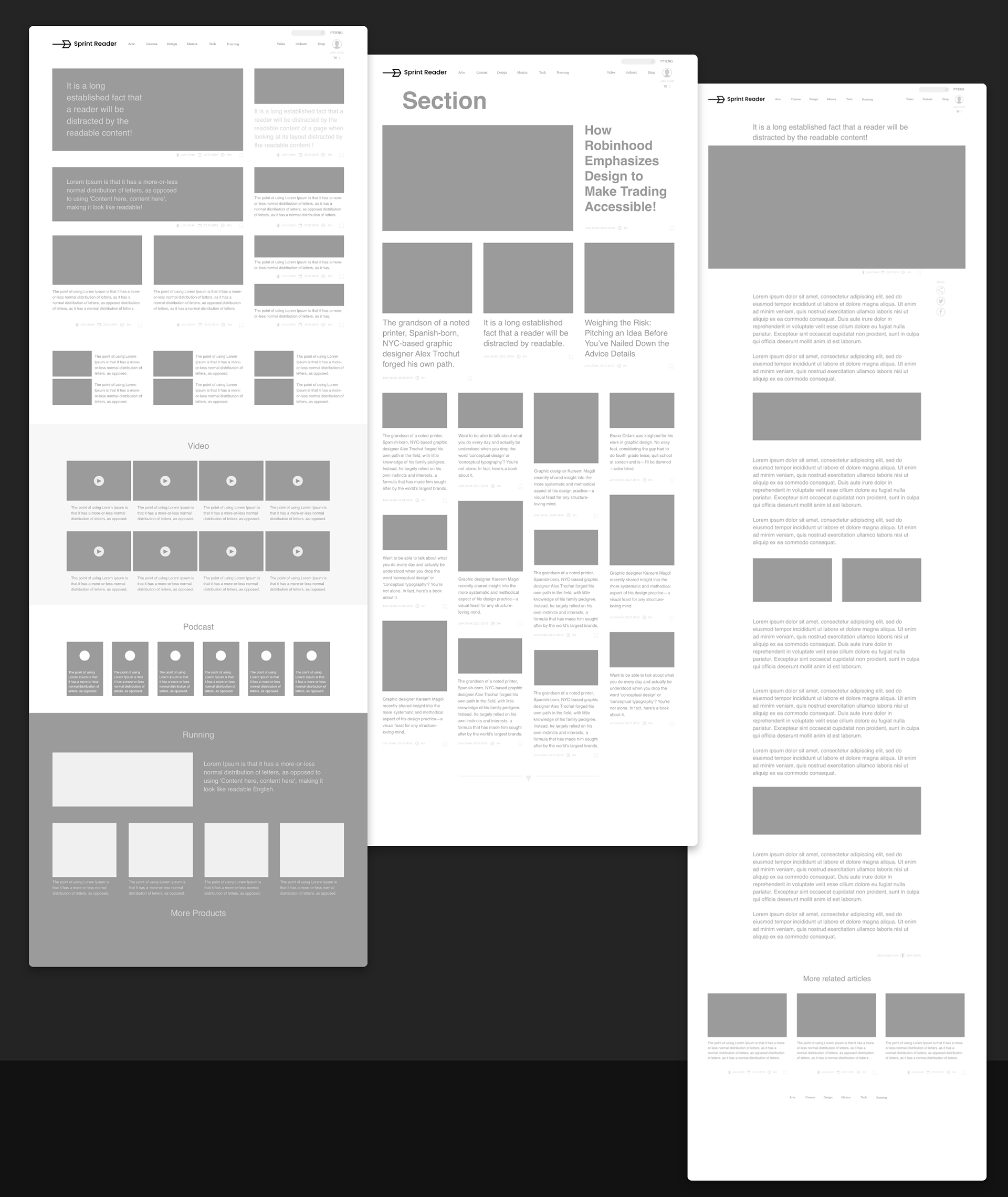
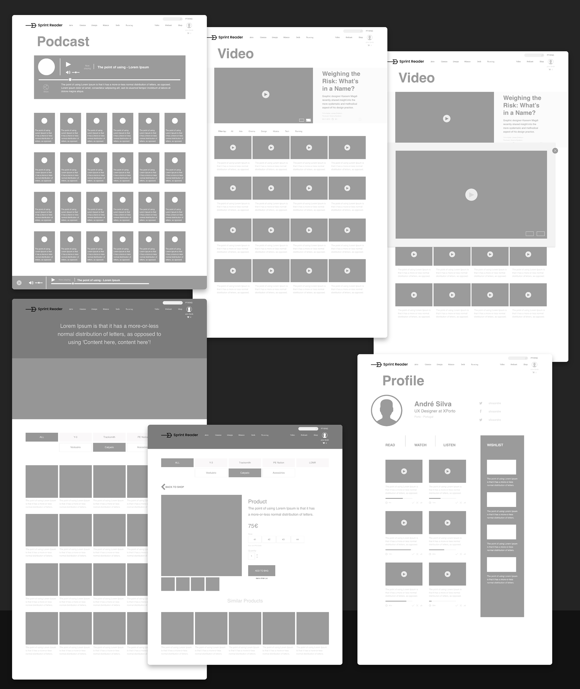
Wireframes
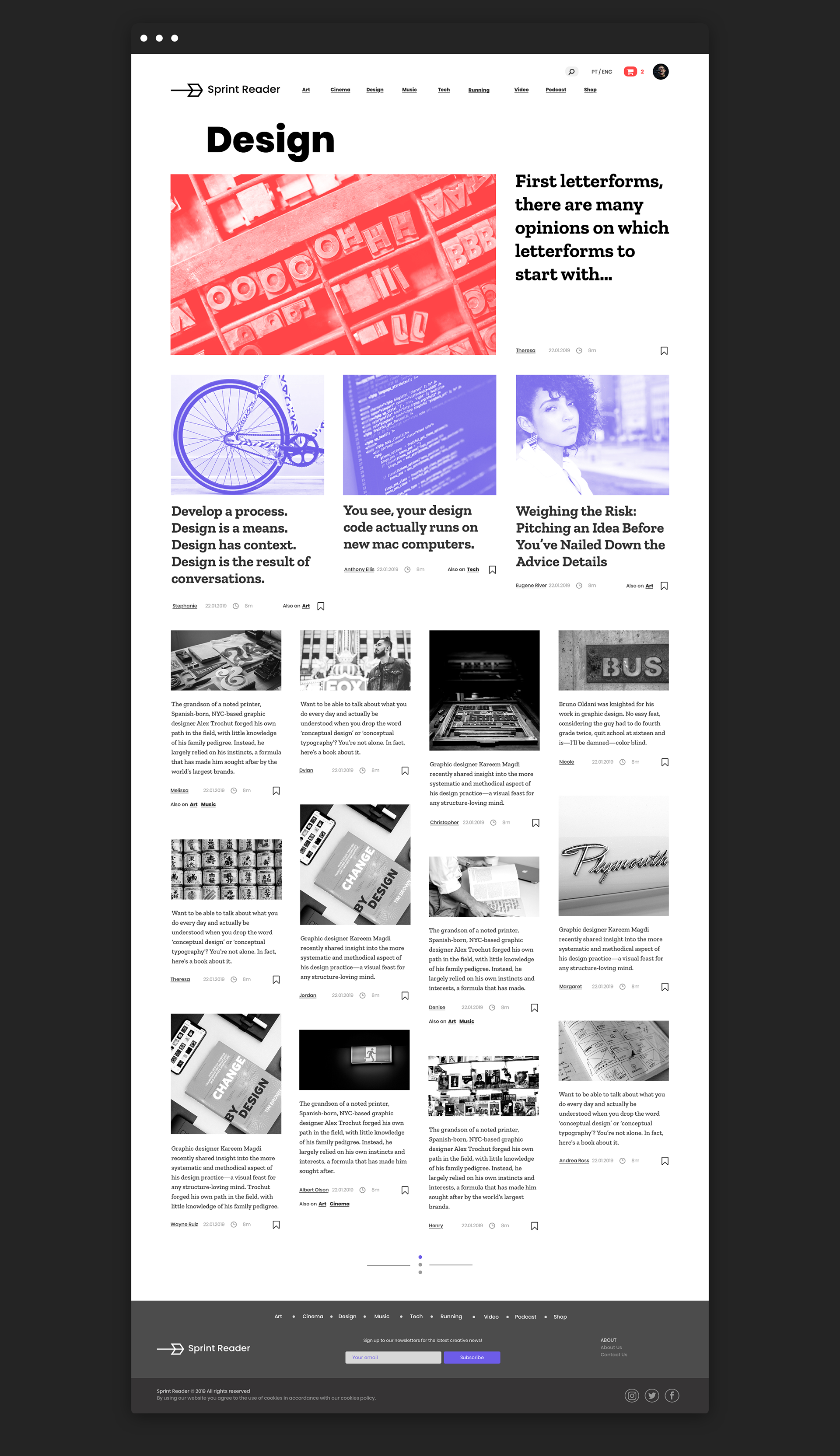
Wireframe design is the starting point for structural product development. This process focused on the basic structure of the product before the visual design and content. We used the wireframe process to lay out the product’s content and functionality which takes into account user needs and journeys.
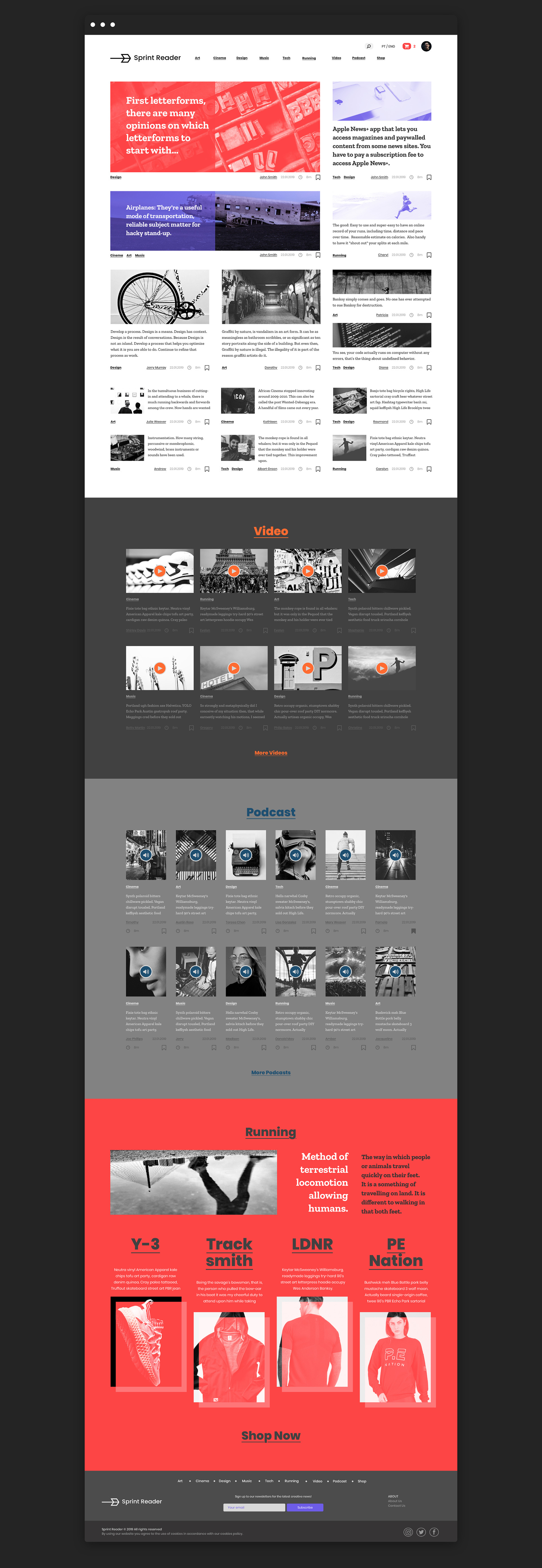
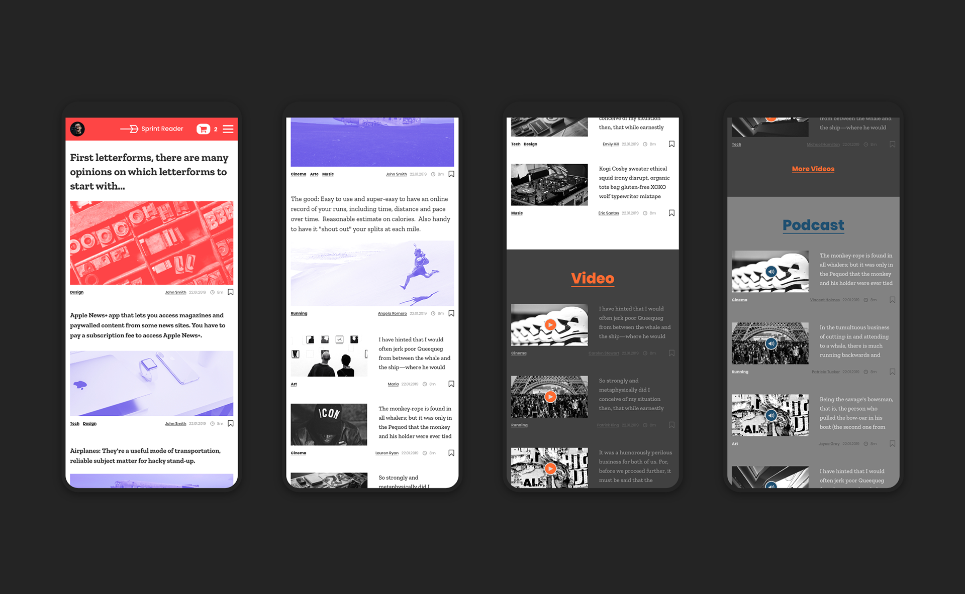
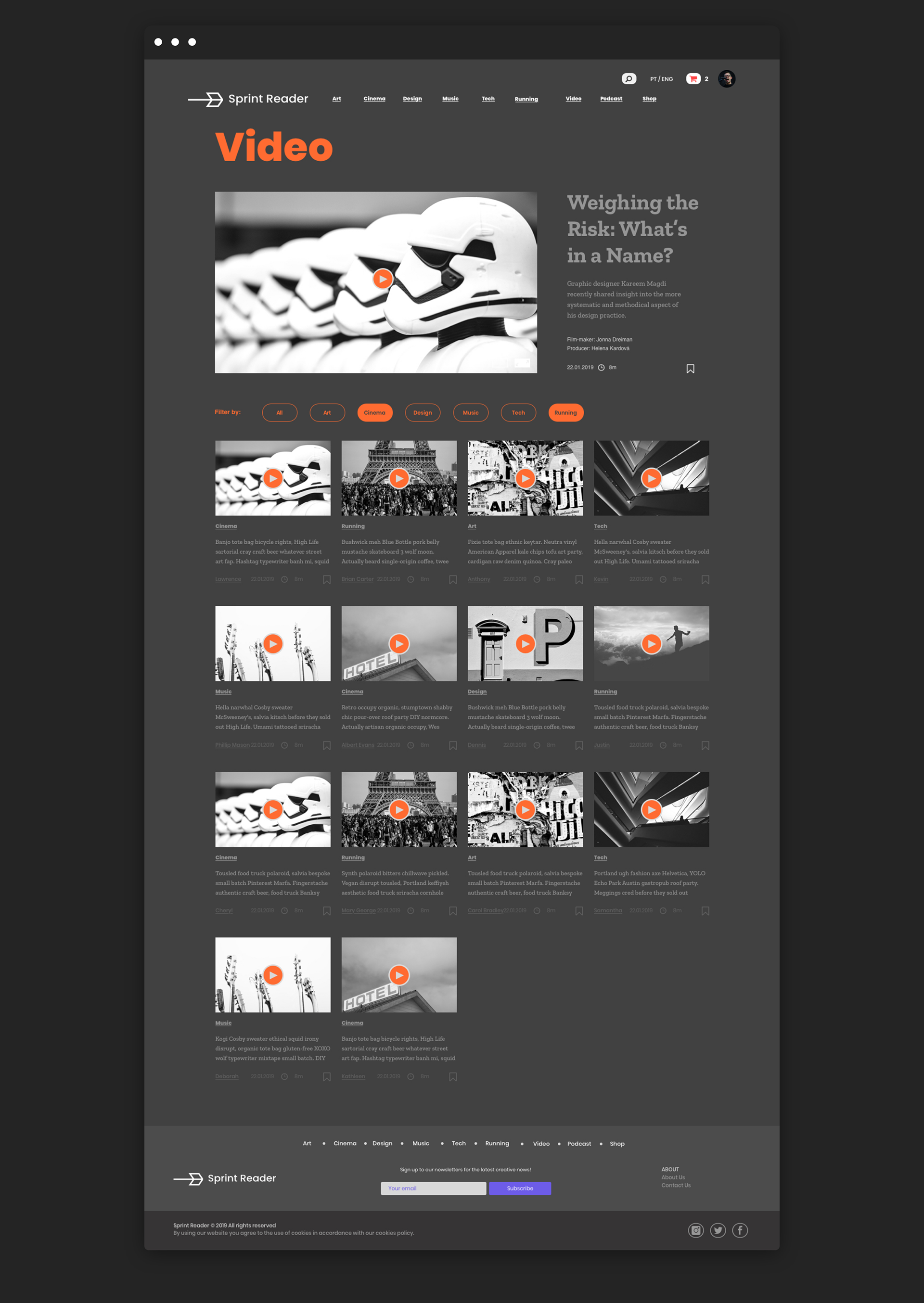
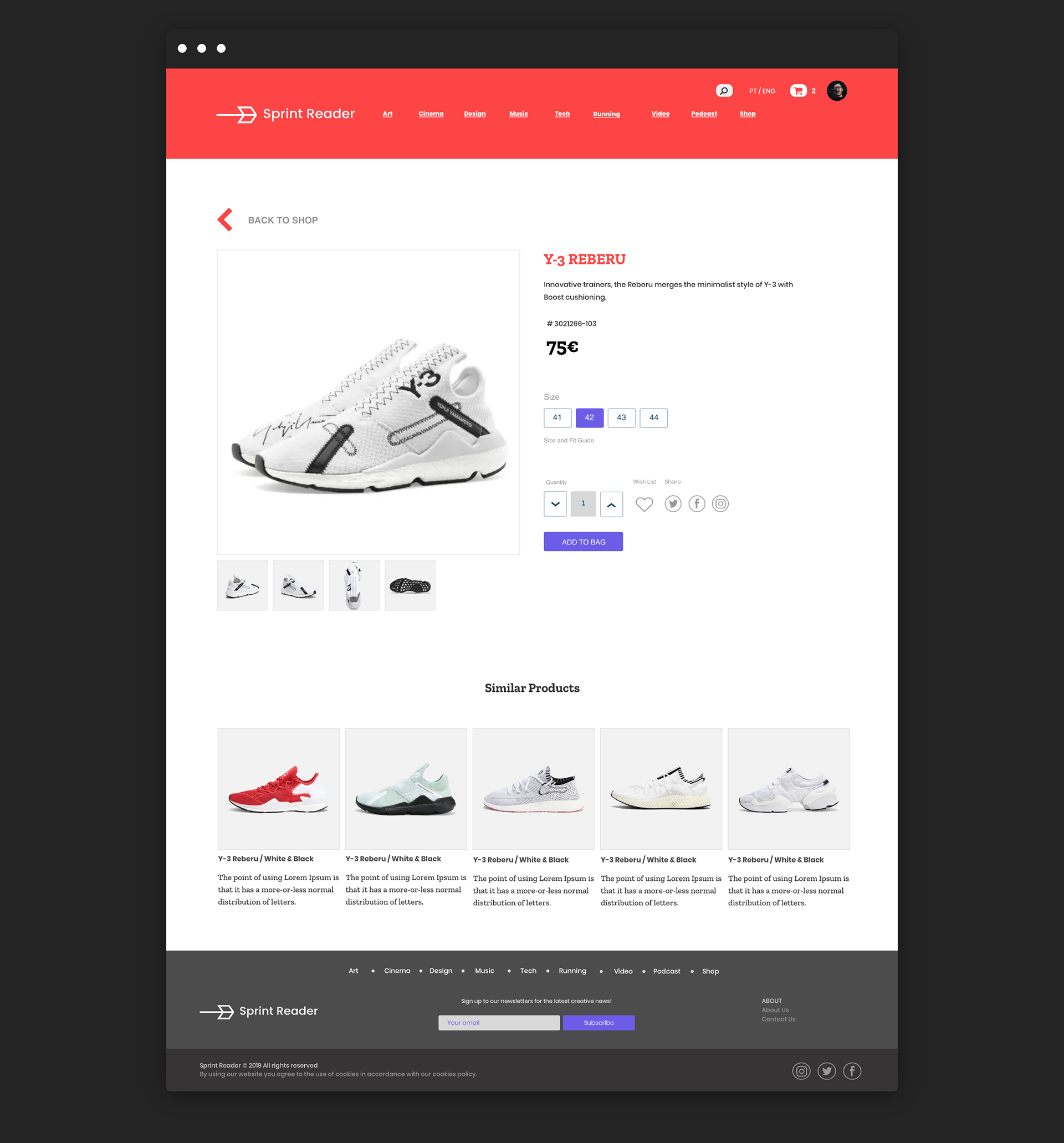
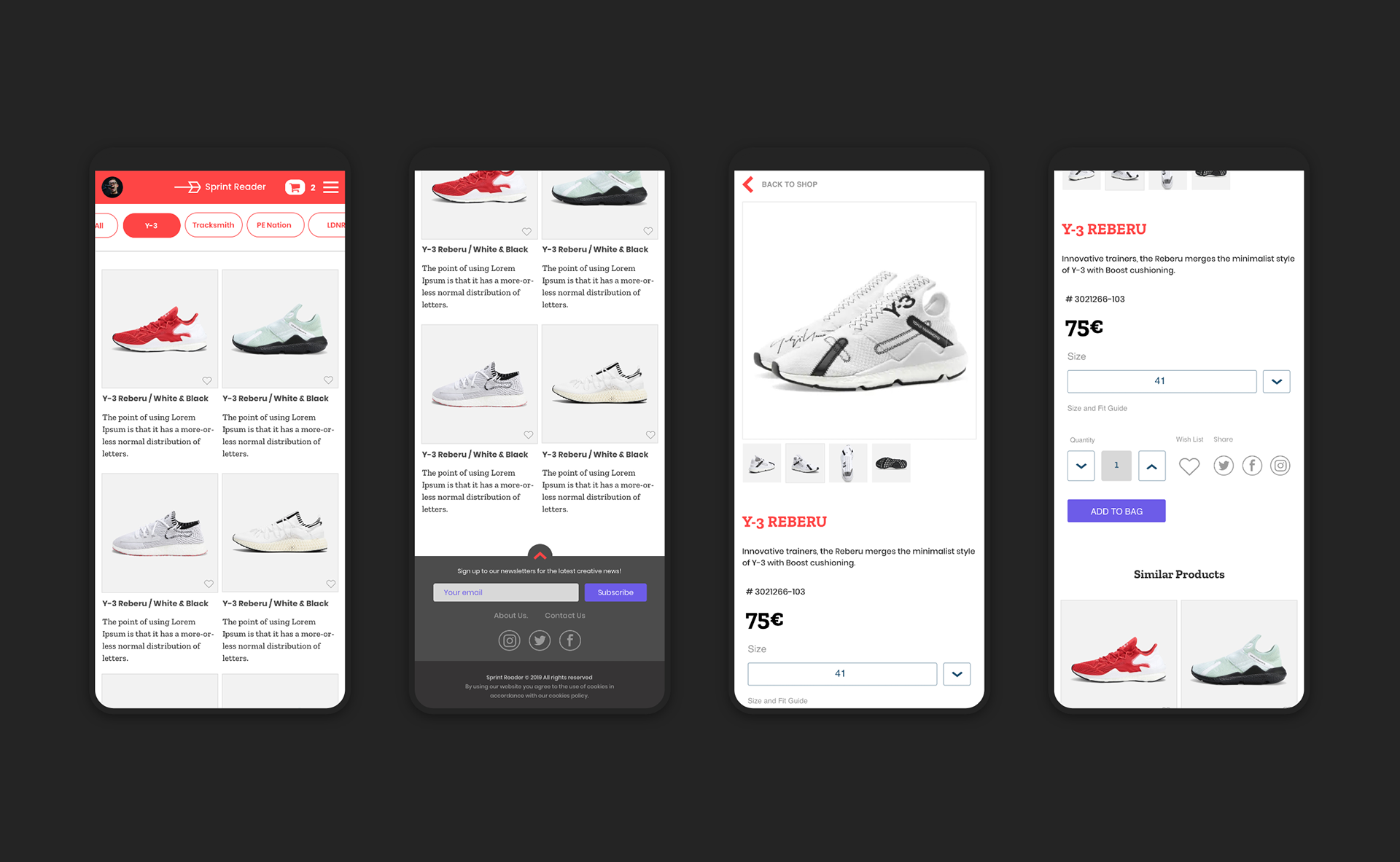
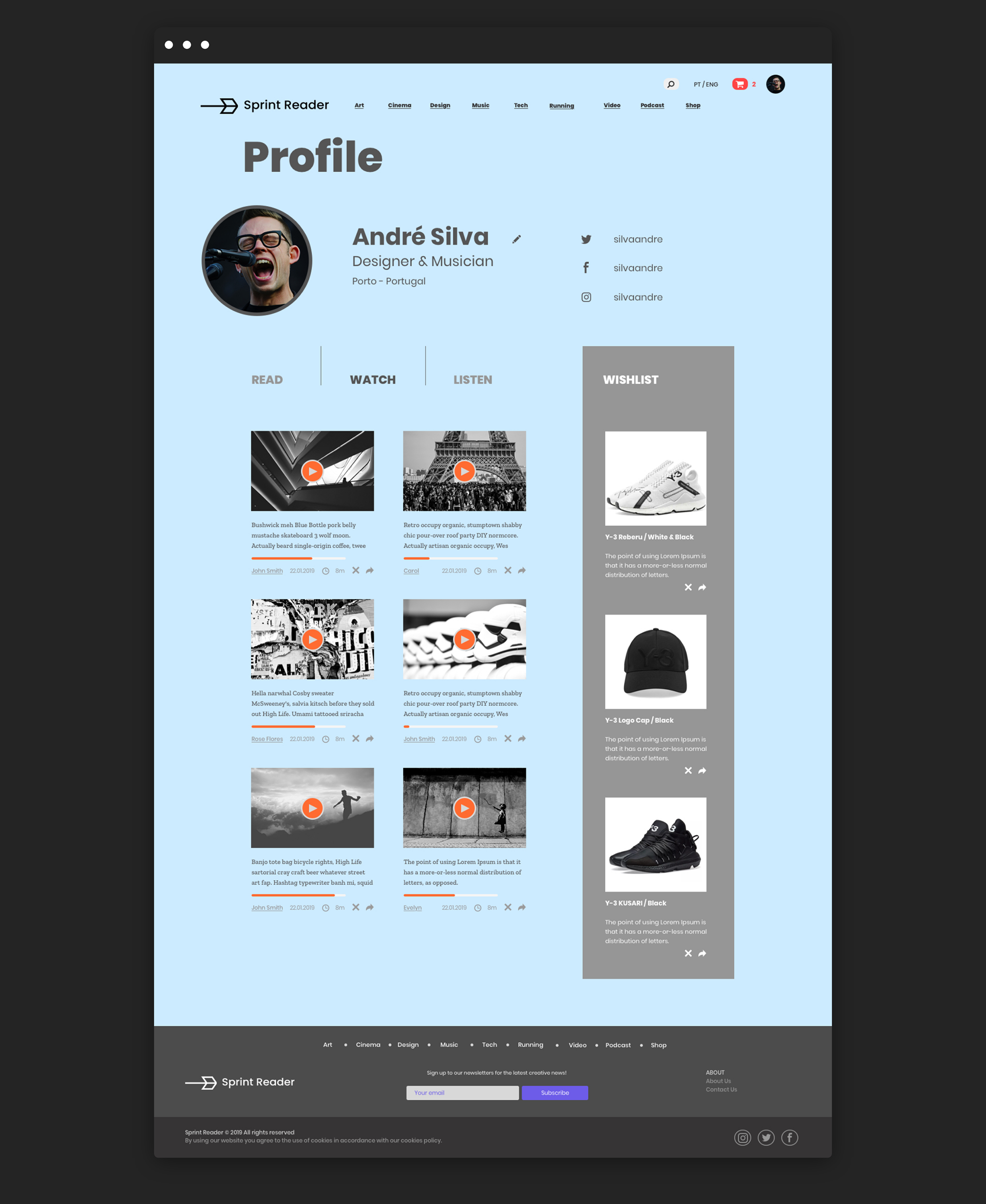
Final Mockups
Thankyou!