Client
Cocus Portugal
Role
UX Design + UI Design
Tools
Notion + Balsamiq + Adobe XD
Cocus Portugal
Role
UX Design + UI Design
Tools
Notion + Balsamiq + Adobe XD
Background
Cocus works at the critical intersection of IT and business. True to their name – Company for Customers – they are proud to develop tailored IT solutions with a focus on the Internet of Things, Blockchain, Data Analytics, and Information Security. Their customers are world leaders in der respective industries – telecommunications, tourism, media, automotive, transport, and logistics – impacting the lives of millions across the world.
Challenge
Cocus challenged me to redesign two screens of their new app for a travel agency client. The app is used in several different countries including the UK. It is built on a single codebase that can be tailored to suit a broad set of markets and brands.
The app allows users to explore what the agency has to offer and book new products such as holidays, flights, and excursions. Customers with an existing booking can access this through the app to find details of their trip including itinerary, boarding passes, destination guides, and travel advice.
The app allows users to explore what the agency has to offer and book new products such as holidays, flights, and excursions. Customers with an existing booking can access this through the app to find details of their trip including itinerary, boarding passes, destination guides, and travel advice.
Brief
I had to look at two screens they have in the app and consider what an improved version of each screen might look like.
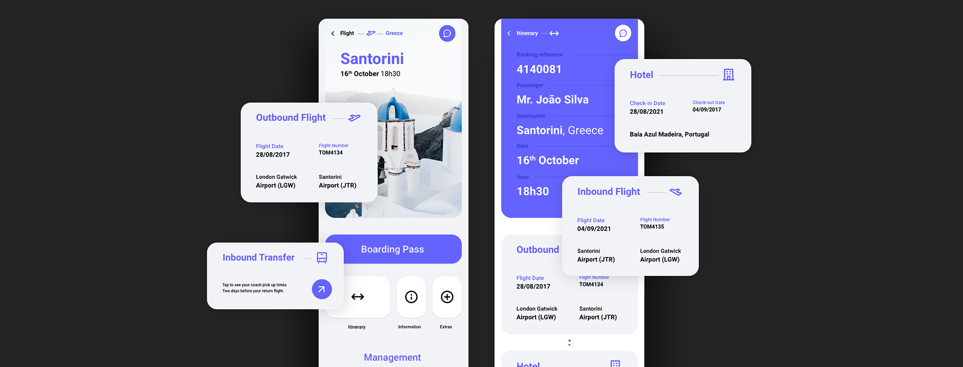
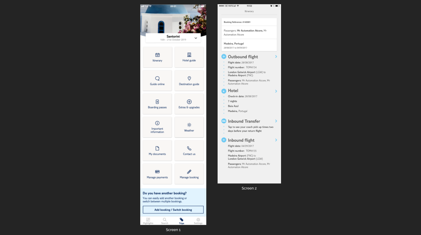
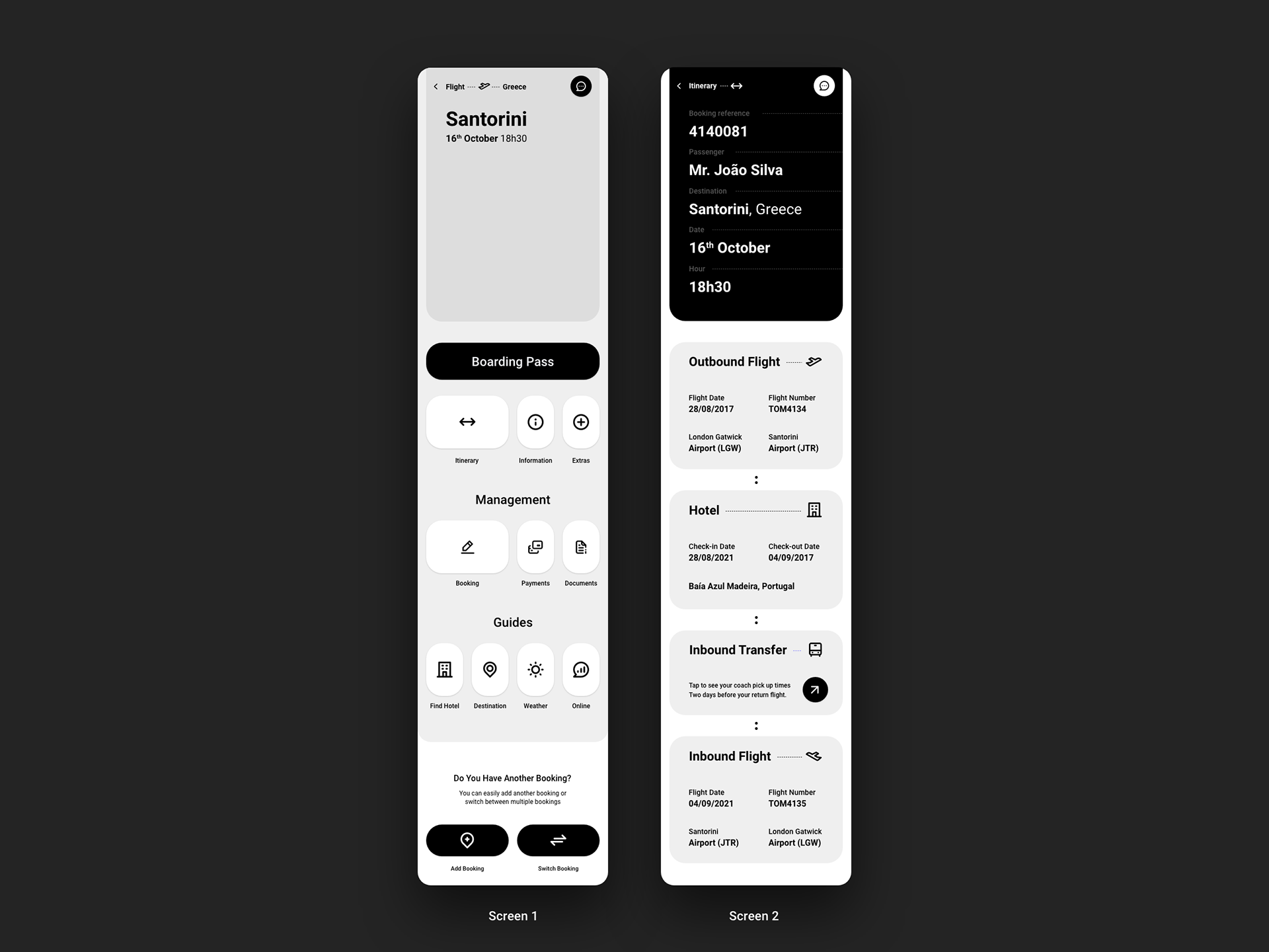
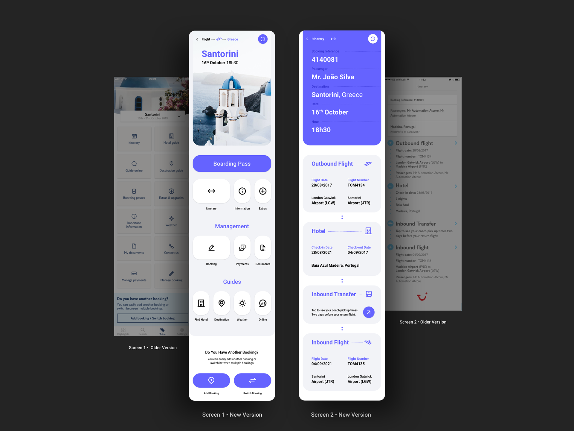
Screen 1 • Trip Dashboard
This screen is presented to users when they access their holiday bookings.
This screen should provide simple access to a wide range of information relating to a customer’s trip.
The amount of information on-screen depends on the type of booking each user has. More features are added to the screen, turning it longer and less manageable. It is important to create a flexible design approach to simplify and improve the user’s experience.
Screen 2 • Itinerary
This screen is accessed from the trip dashboard.
Outline all the main events throughout a customer’s holiday that collectively form their itinerary.
Customers can click on each item in the itinerary to access more details (e.g. tapping into the hotel section reveals a hotel guide that outlines the facilities available at that hotel).
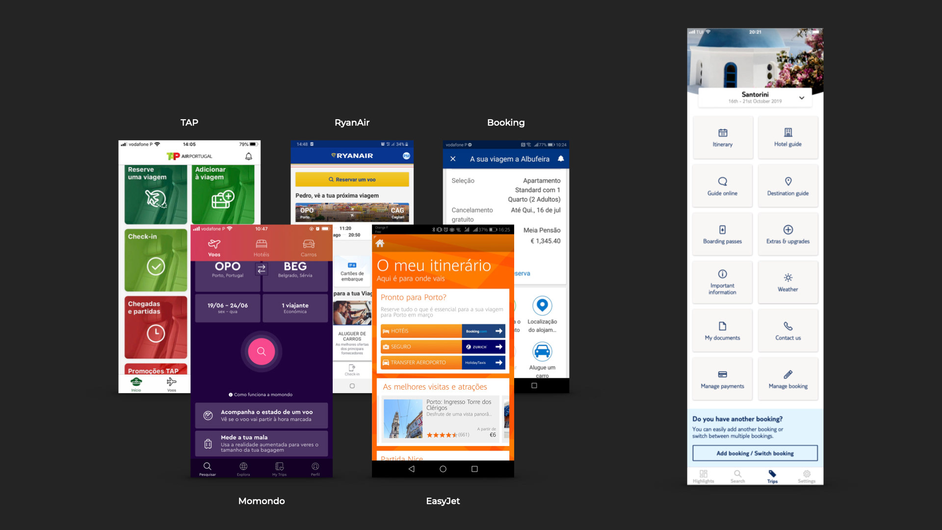
Comparative Analysis
Based on a comparative analysis with direct competitors, a current dashboard list of problems was defined:
• Lack of hierarchy
• IA Problems (Information Architect)
• Unintuitive Navigation
• Uninviting CTAs
• No visual contrast (color, type, alignment)
• Imperceptible
• Lack of hierarchy
• IA Problems (Information Architect)
• Unintuitive Navigation
• Uninviting CTAs
• No visual contrast (color, type, alignment)
• Imperceptible
User Interview
For qualitative analysis, I interviewed some users aged 28 to 50 and observed some common user habits.
Some of the questions asked:
1. After buying your trip do you use your travel app to access your trip information?
2. What information do you consider most important to get in the travel app?
1. After buying your trip do you use your travel app to access your trip information?
2. What information do you consider most important to get in the travel app?
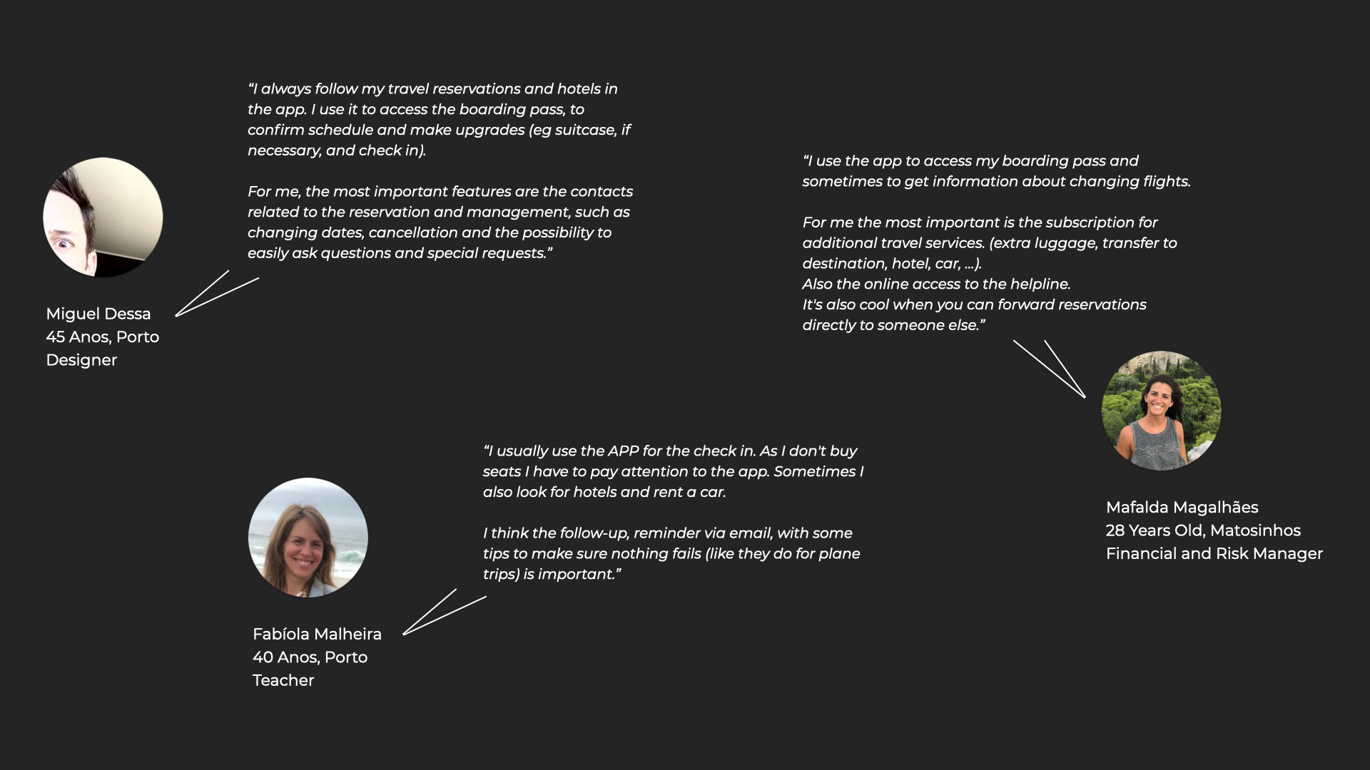
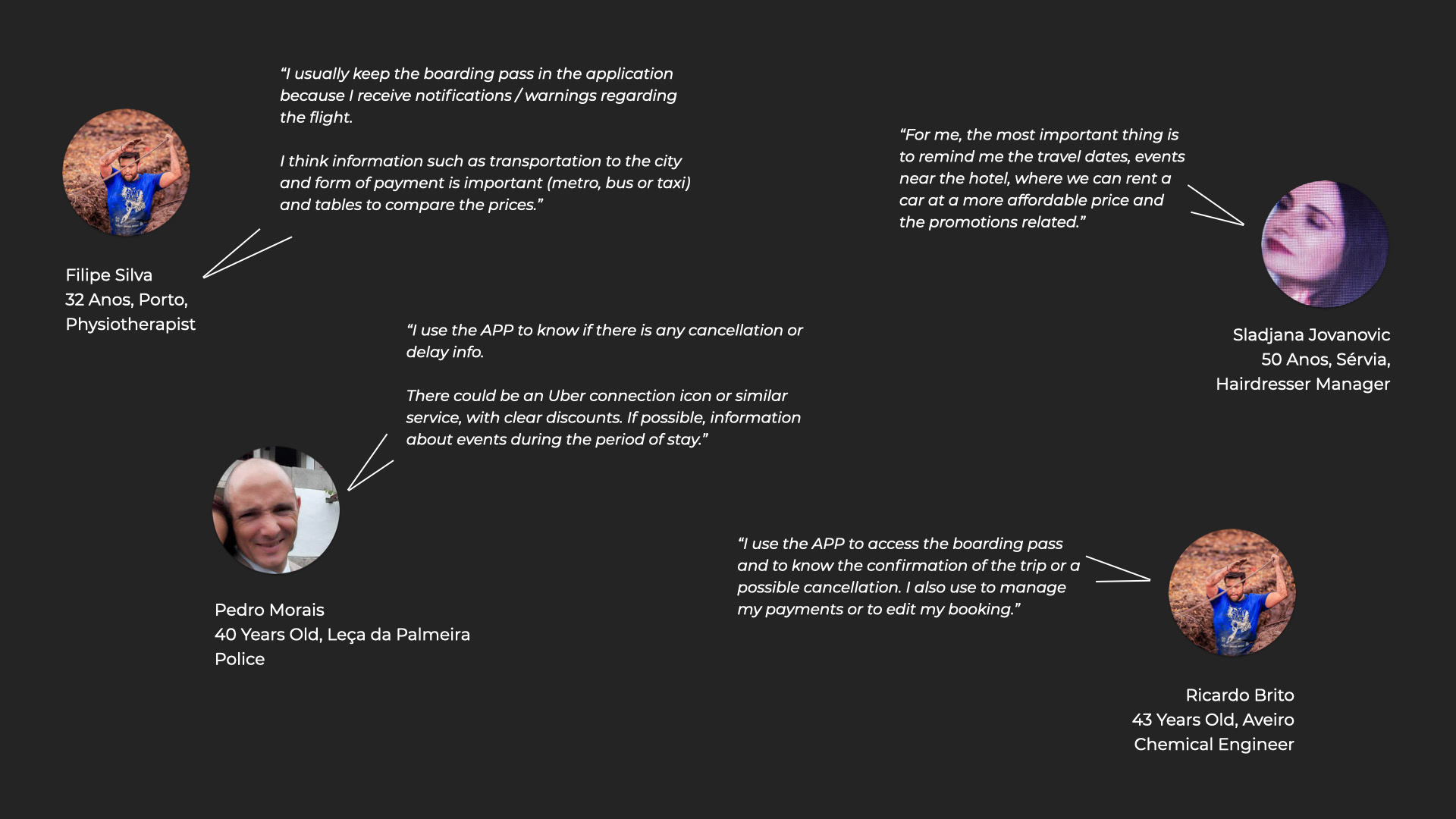
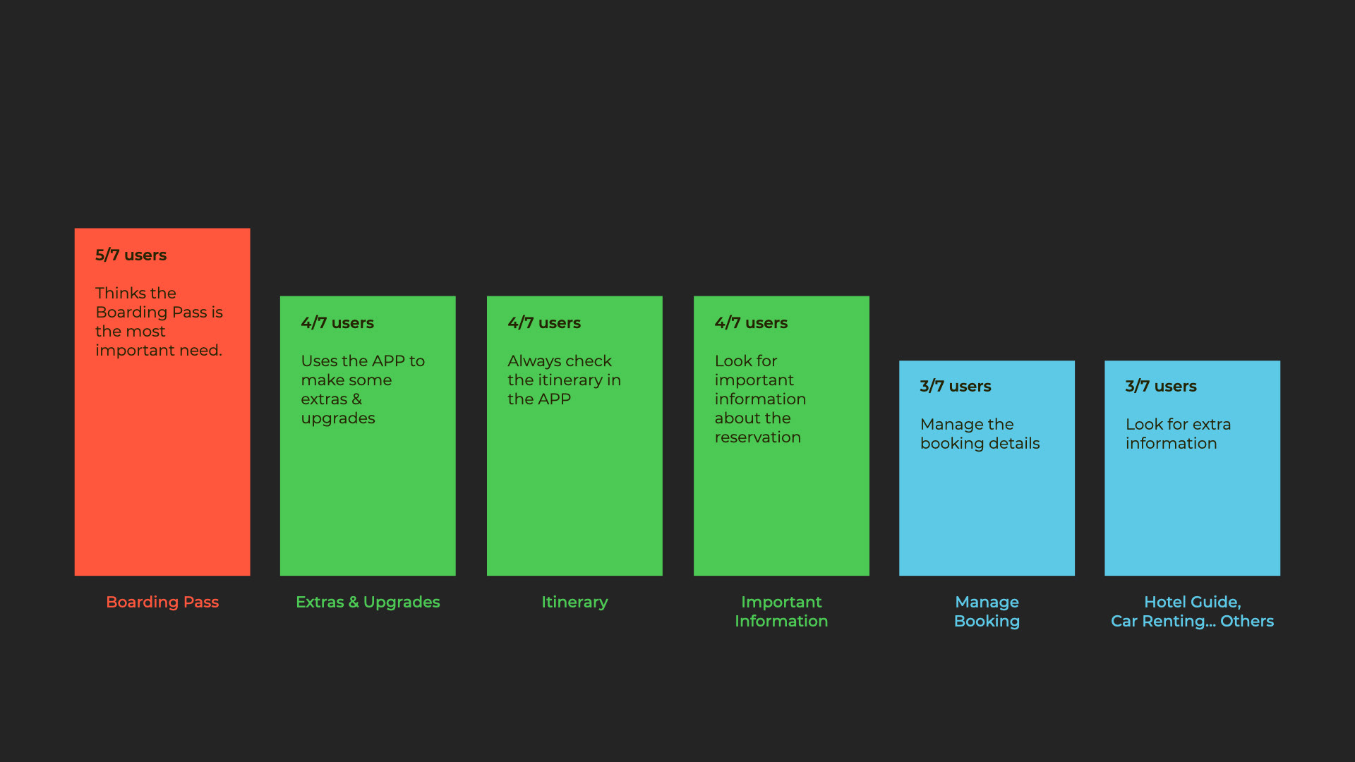
Based on the information collected from the users’ interview, here is a summary of the most relevant info:
Define / Card Sort
Creation of a Card Sort, organized by topics, to define the design and the information architecture.
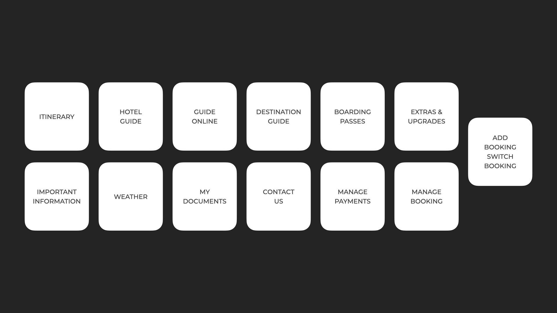
Identification of the topics by similarity and relevance:
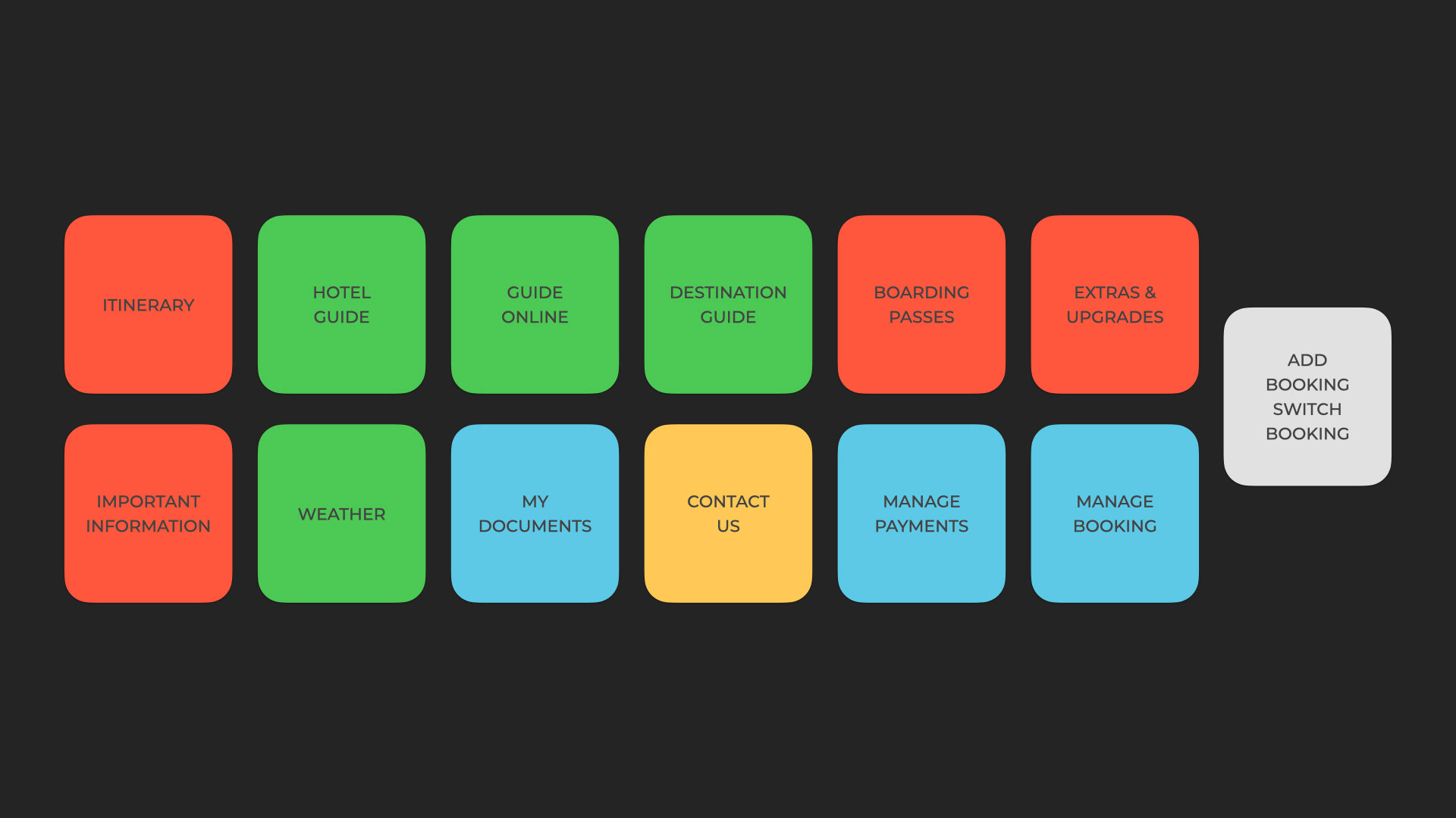
Management of similar topics and categories to simplify the copy.
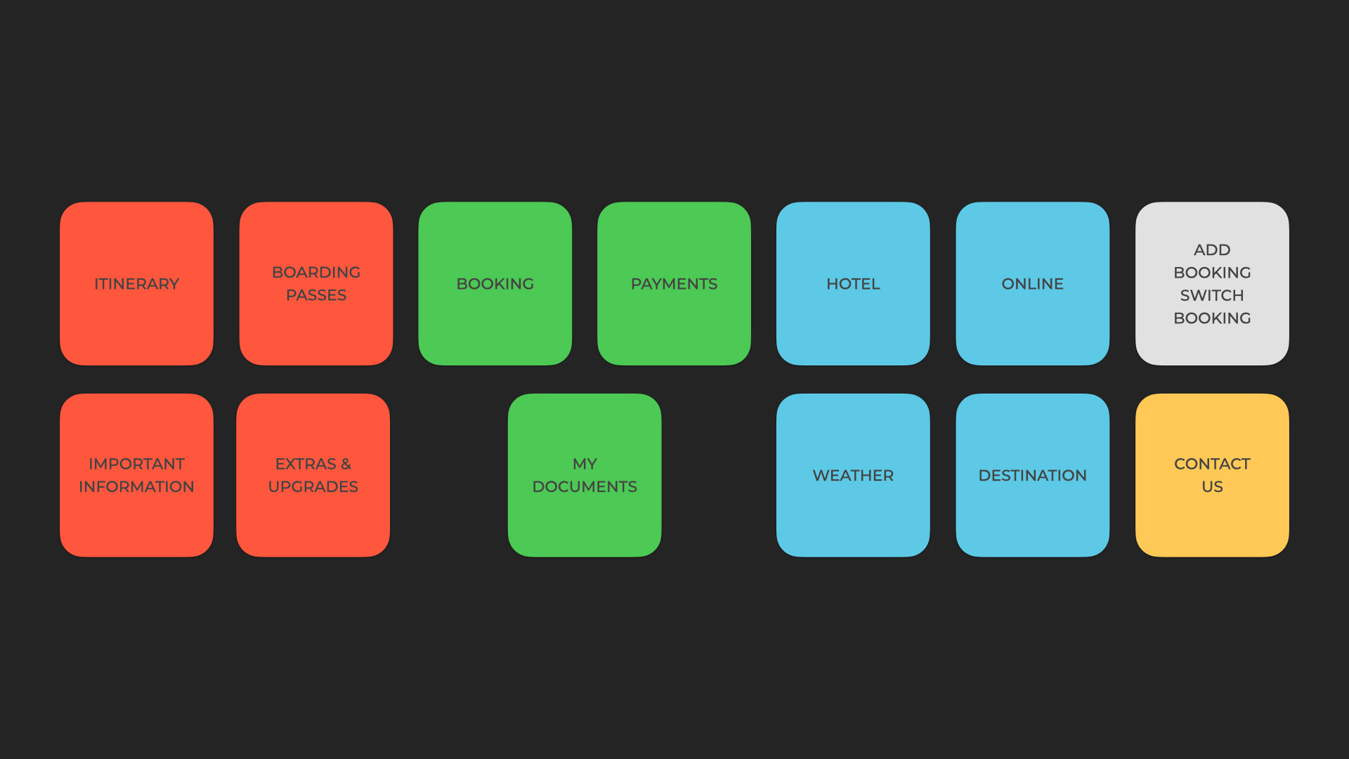
Finally, based on the Card Sort definition and the user’s interviews, creating a new structure to manage the dashboard features hierarchy.
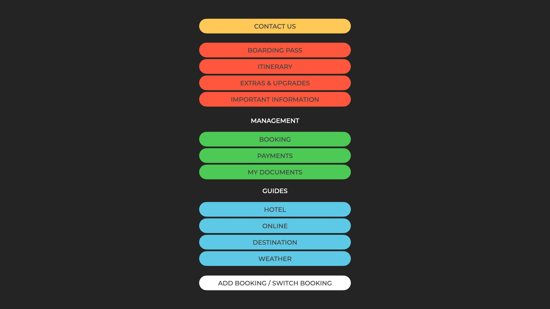
Paper Prototype
Sketches with the dashboard solutions.
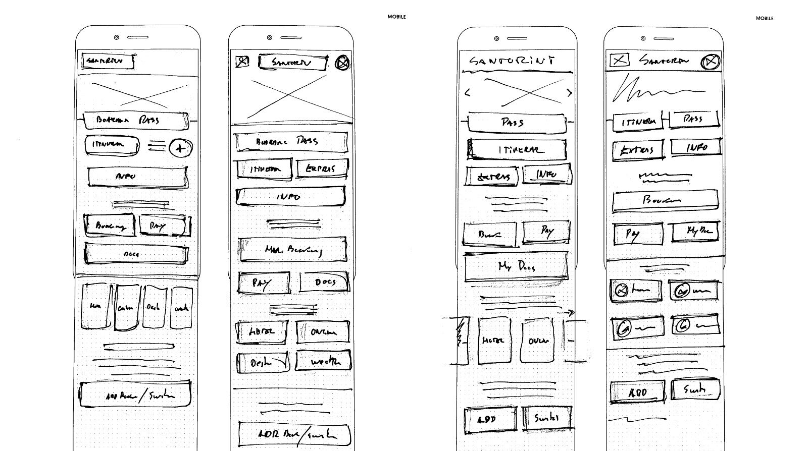
Wireframes
Based on the new dashboard sketches, I created the low-fidelity wireframes to validate the ideas before the final design,
The hierarchy must be well defined and clearly visible.
The hierarchy must be well defined and clearly visible.
Mockups
After validating the high-fidelity wireframe, an update of the final dashboard mockups with visual design elements.
Screen 1 • Trip Dashboard
The most important features were:
• Focus on the color to highlight the main CTAs.
• Color and visual styles to differentiate the sections.
• ‘Contact’ button is highlighted at the top of the screen.
• Generally the icons are added to the buttons.
• Color and visual styles to differentiate the sections.
• ‘Contact’ button is highlighted at the top of the screen.
• Generally the icons are added to the buttons.
Screen 2 • Itinerary
The main problems detected on screen 2 were:
• Unintuitive Navigation
• Uninviting CTAs
• No visual contrast (color, type, alignment)
• Imperceptibility
The proposed solutions:
• Uninviting CTAs
• No visual contrast (color, type, alignment)
• Imperceptibility
The proposed solutions:
• Highlight the main information
• Contrasting CTAs
• Information organized by card design.
• Applying the same styles used on the screen 1 dashboard.
• Contrasting CTAs
• Information organized by card design.
• Applying the same styles used on the screen 1 dashboard.
Thankyou!